User interface colors
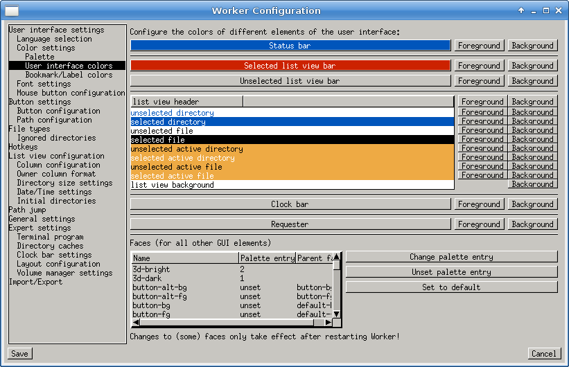
This is where to change the default colors of worker. Simply click on the Foreground or Background buttons beside the item you wish to change the appearance of. The color palette as defined in the Palette section will appear.
Working with the panel colors can get a little confusing, especially if you mix up the meanings of selected and active. Active means any file or directory that the cursor is currently on. Press the up or down arrows and this should be apparent. Selected is any file or directory that has been explicitly selected by you. Press the insert button on your keyboard to see this.
Faces
Since Worker 3.5.0, the concept of "faces" has been introduced. This allows more flexibility for configuring the appearance of Worker. Basically, a face describes a specific UI element. A face may be derived from another face so that a color from a parent face also applies for the derived faces, if not overwritten. For example, the text and background color of an UI element may be derived from the default text color and default background color. Changing these colors will automatically change the text colors of many UI elements as well. If a face is unset, the color of the parent element will be used.
The following table contains all faces and their meaning:| Face | Meaning |
|---|---|
| default-fg/bg | Default text color and background color |
| 3d-bright | Color used for 3D effect (usually white or some other bright color) |
| 3d-dark | Color used for 3D effect (usually black or some other dark color) |
| button-fg/bg | Text and background color of buttons |
| button-special1-fg/bg | Text and background color of buttons which are sometimes used to highlight a special function. |
| button-alt-fg/bg | Text and background color of the alternate function of buttons |
| popup-fg/bg | The text and background color for popup menus |
| popup-submenu-arrow | The color of the arrow indicating submenus |
| popup-edit-field-bg | The background color for edit fields in popup menus |
| popup-highlight-fg | The foreground color of highlighted popup entries |
| stringgadget-normal-fg/bg | Text and background color of text fields |
| stringgadget-selection-fg/bg | Text and background color of selection in text fields |
| stringgadget-active-fg/bg | Text and background color of active text fields |
| textview-fg/bg | Text and background color of text view elements |
| textview-selection-fg/bg | Text and background color of selected text in text view elements |
| textview-highlight-fg/bg | Text and background color of highlighted lines in text view elements |
| listview-normal-fg/bg | Text and background color of regular list view elements |
| listview-select-fg/bg | Text and background color of selected list view elements |
| listview-active-fg/bg | Text and background color of active list view elements |
| listview-selact-fg/bg | Text and background color of selected and active list view elements |
| listview-sort-indicator | The color of the arrow in the list view header to indicate the sort direction |
| fg-bg-mix66 | This special color is used for a mixed color 66% between default foreground and default background. It is automatically derived from those colors unless overwritten. |
| bg-90 | This special color is 90% of the default background color. It is automatically derived from that color unless overwritten. |
| bg-30 | This special color is 30% of the default background color. It is automatically derived from that color unless overwritten. |
| slider-arrow | This is the color used for the arrows in slider elements. |
| slider-bg | This is the color of the slider box background. |
| slider-bg2 | This color is used for the area behind the slider box. |
| slider-selection | This color is used to highlight which part of the elements is selected. |
| tab-active-fg/bg | This is the foreground and background color of the active tab box. |
| tab-inactive-fg/bg | This is the foreground and background color of the inactive tab boxes. |
| statusbar-fg/bg | These are the colors of the status bar. |
| clockbar-fg/bg | These are the colors for the clock bar. |
| request-fg/bg | These are the colors used for some dialogs. |
| lvb-active-fg/bg | This is the foreground and background color for the active list view bar. |
| lvb-inactive-fg/bg | This is the foreground and background color for the inactive list view bar. |
| dirview-dir-select-fg/bg | These are the colors for selected directory entries in directory views. |
| dirview-dir-normal-fg/bg | These are the colors for unselected directory entries in directory views. |
| dirview-file-select-fg/bg | These are the colors for selected file entries in directory views. |
| dirview-file-normal-fg/bg | These are the colors for unselected directory entries in directory views. |
| dirview-dir-selact-fg/bg | These are the colors for the active directory entry which is also selected in directory views. |
| dirview-dir-active-fg/bg | These are the colors for the active directory entry (which is not selected) in directory views. |
| dirview-file-selact-fg/bg | These are the colors for active file entry which is also selected in directory views. |
| dirview-file-active-fg/bg | These are the colors for active file entry (which is not selected) in directory views. |
| dirview-header-fg/bg | These are the colors for header line of directory views. |
| dirview-bg | This color is used for the background color of directory views. |